This is the step-by-step for Edit mode specifically. For what a dashboard is, sheets, and the getting-started overview, read Your dashboard first.
Your dashboard is not one fixed screen. Every widget on it can be moved, resized, added or removed, and every module you use gets its own pre-built sheet to start from. This walks through Edit mode step by step: rearranging widgets, adding one from the picker, and saving your changes.
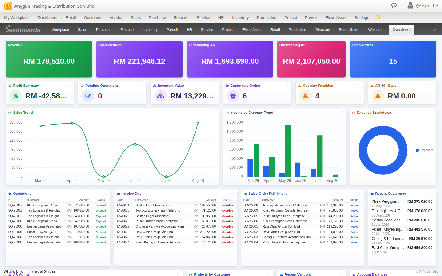
1. Enter Edit mode
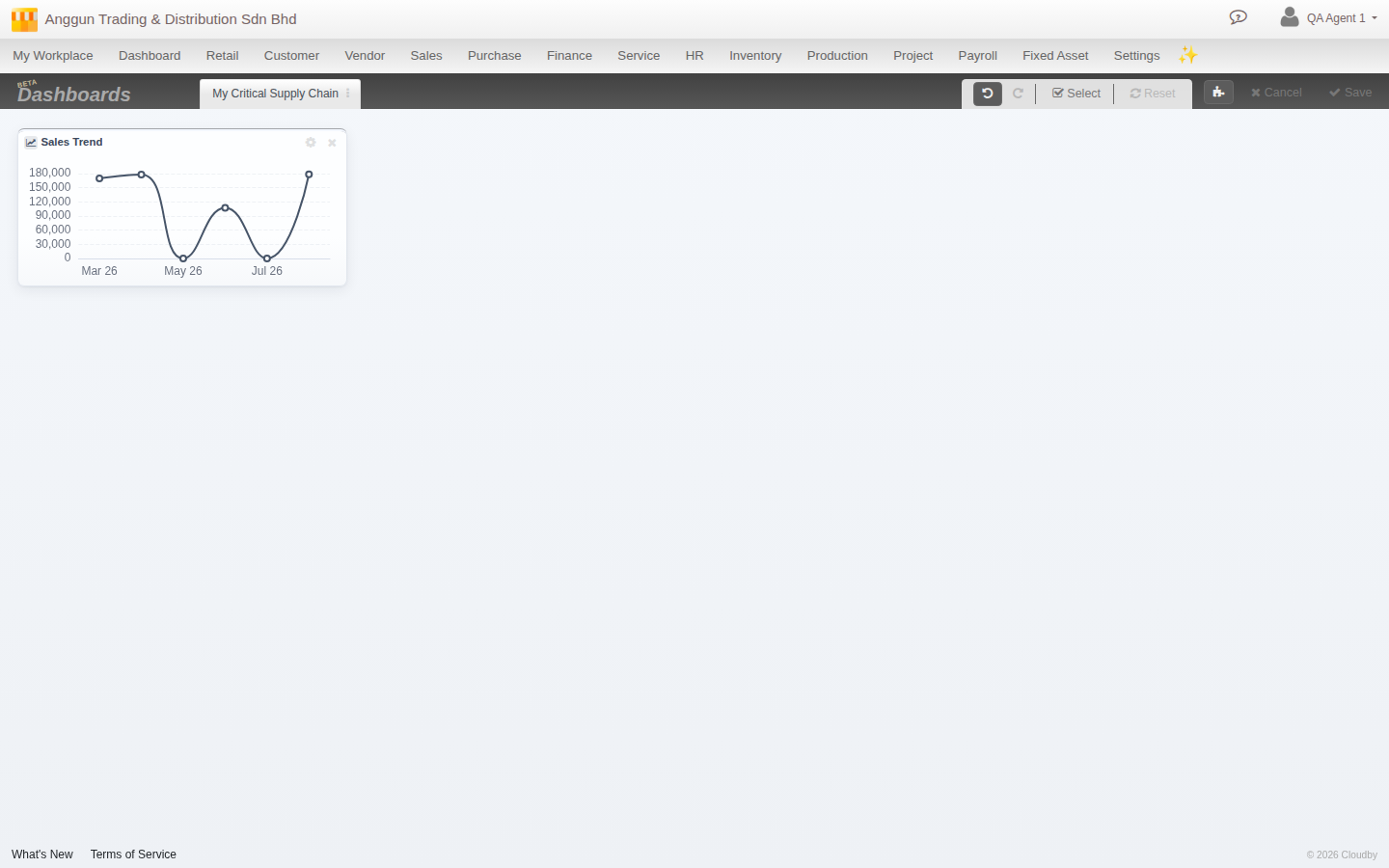
Click Edit at the top right of the dashboard panel. The tab strip collapses to just your current sheet’s name, and an edit toolbar appears: Undo, Redo, Select (for removing several widgets at once), Reset (back to the sheet’s original layout), Add widget, Cancel and Save. Nothing you do from here is final until you click Save.
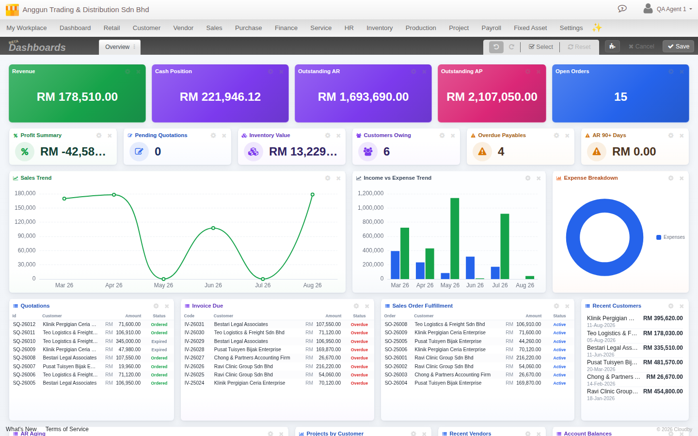
2. Move a widget
Click and hold anywhere on a widget’s header, then drag it to a new spot on the grid. The other widgets reflow around it as you drop it, the same way you would rearrange app icons on a phone.
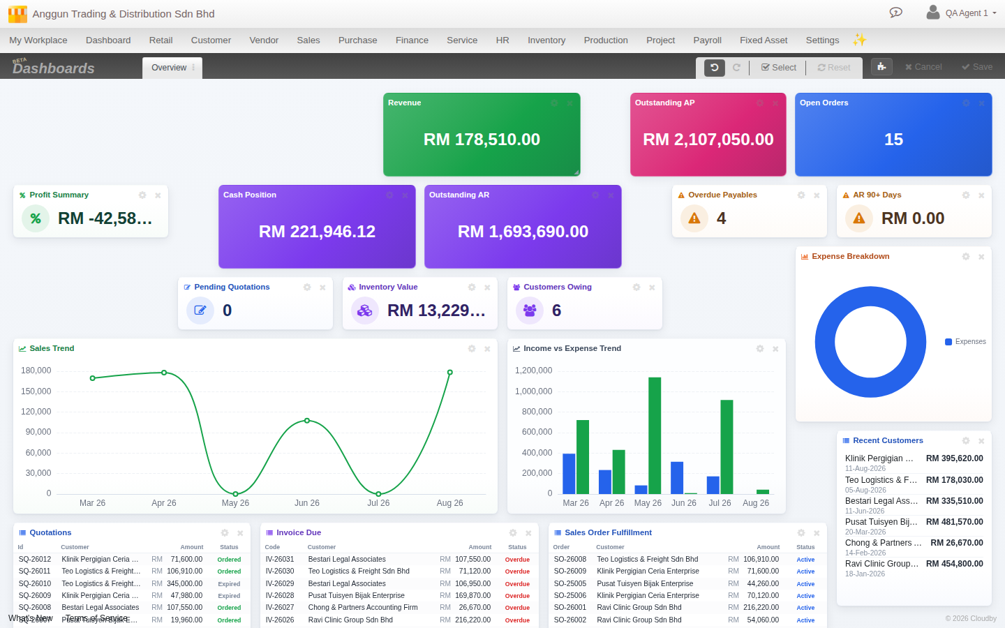
3. Resize a widget
Grab the small handle in a widget’s bottom-right corner and drag it to whatever shape suits the content, a wide chart, a compact tile, a tall list. Nothing else on the sheet needs to move by hand, the grid repacks around the new size.
4. Style a headline widget
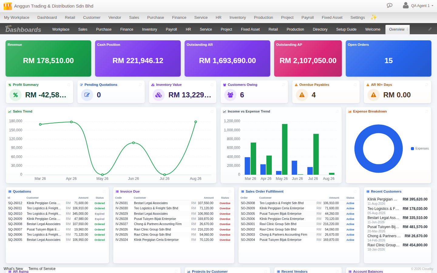
The big number tiles at the top of a sheet, Revenue, Cash Position, Outstanding AR, are called headline widgets. Every widget on your dashboard carries three independent style choices, but they matter most here: click a widget’s gear to open Size, Accent and a colour palette alongside any settings it has.
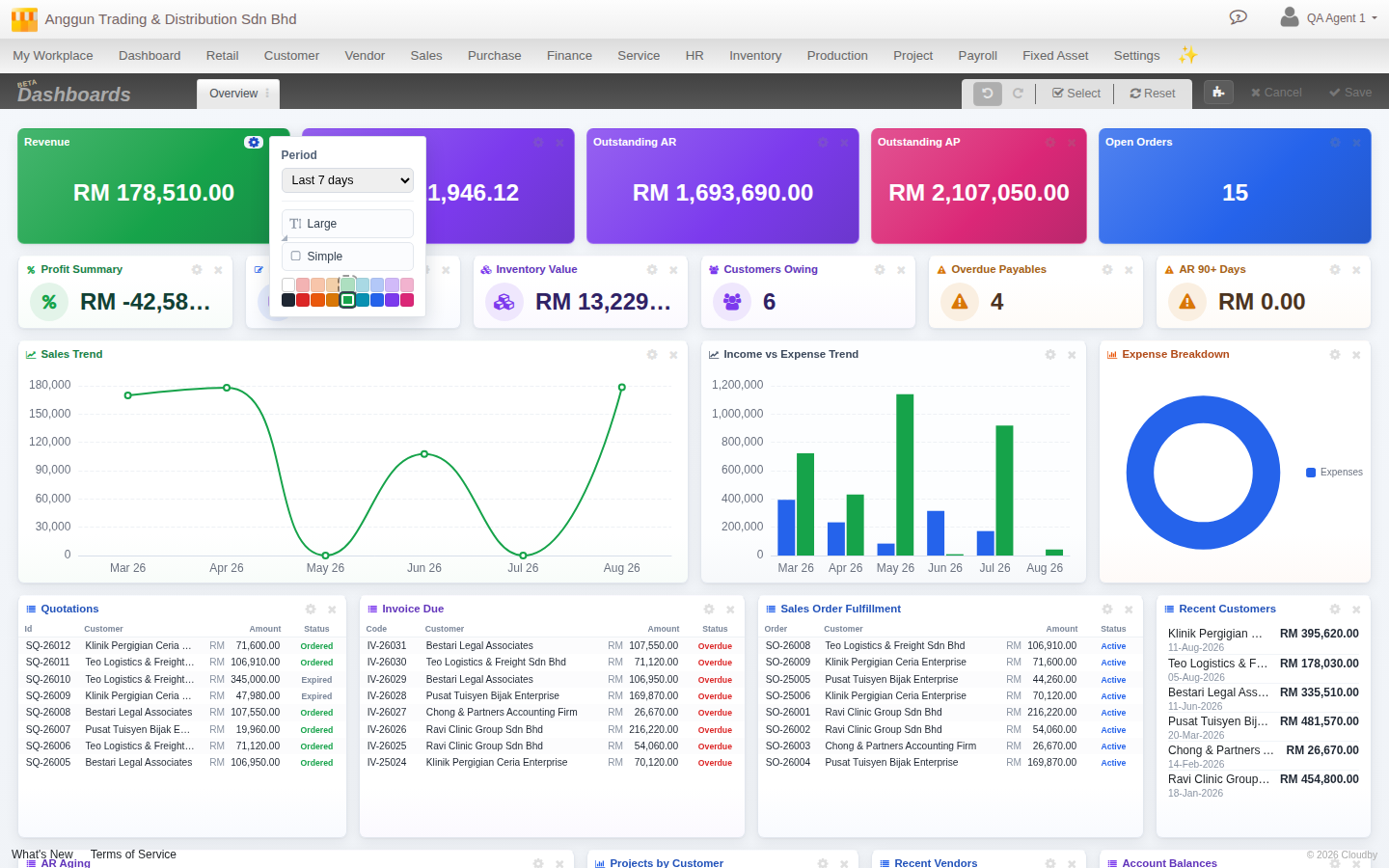
Size: Small, Medium or Large, each a genuinely different layout
Click the size button to cycle Small → Medium → Large. This is not just a bigger or smaller version of the same card, each size lays itself out differently:
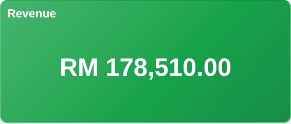

- Large centres the number, drops the icon, and is built to dominate the top of a sheet, this is what Cloudby’s own hero tiles (Revenue, Cash Position, Outstanding AR/AP) all use.
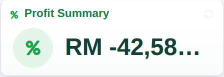
- Medium adds a round icon badge beside a smaller number, a self-contained card with room to breathe.
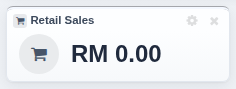
- Small collapses everything onto one line, title on the left, value on the right, the most compact option for a row of secondary stats you still want visible.
Cloudby’s own default sheets use all three: Large for the hero numbers on every sheet, and either Medium or Small underneath for the secondary stats, whichever fits more comfortably in the row. Both are valid choices for a smaller supporting tile, pick whichever suits how many you’re placing side by side.
Colour: 18 shades, chosen with intent
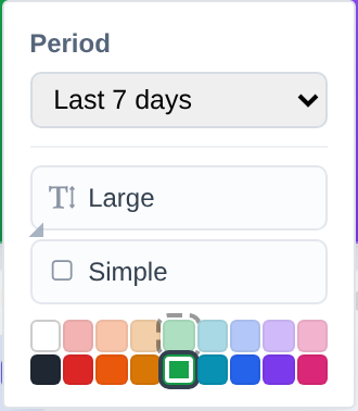
The colour grid gives you white plus eight hues (red, orange, amber, green, teal, blue, purple, pink), each in a light or a dark shade. A headline tile can take any of the 18, including the bold dark shades; a chart or table widget is restricted to the light shades only, since their content is drawn for a light background and would be unreadable on a dark one.
Accent: how much decoration the tile carries
The accent button cycles three looks:
- Accent: the full treatment, an icon in a filled badge in the corner.
- Flat: the same icon, but plain, no filled badge.
- Simple: no icon at all, just the number and its label, the cleanest option.
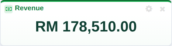
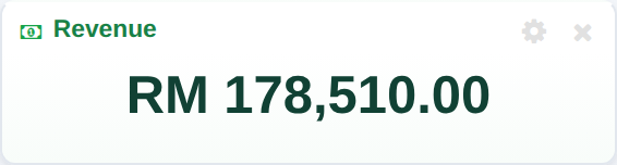
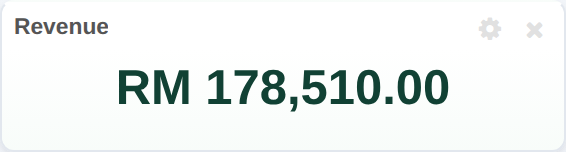
Cloudby’s own hero tiles ship set to Simple, on the idea that a large, boldly coloured tile doesn’t need an icon to identify it, the colour and the number already do the job. Reach for Accent or Flat on a smaller tile where the icon helps you scan a busy row quickly.
5. Add a widget
Click Add widget to open the picker. Widgets are grouped into a family for every module you are subscribed to, so a growing business with Sales, Finance, Payroll, Retail and more all switched on sees all of them here, each with its own count of what is available to add.
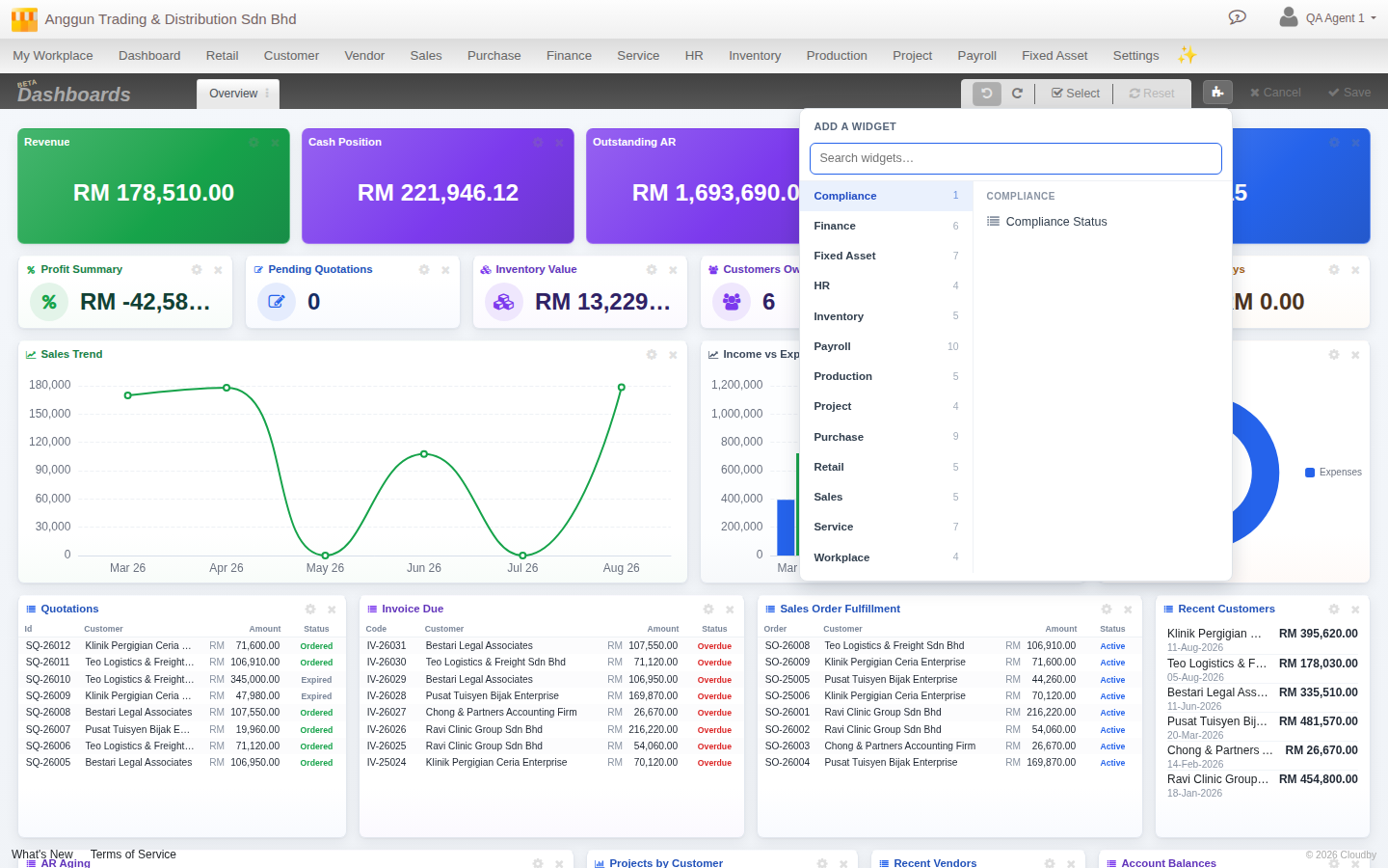
Click a family to see its widgets, then click one to add it straight onto your sheet.
6. Remove a widget
Hover over any widget in Edit mode and a small gear and × appear in its header. The gear opens its settings (like the period a chart covers); the × removes it from the sheet. To remove several at once, use Select in the edit toolbar, click each widget you want gone, then remove the selection in one action.
7. Undo and redo while you work
8. Save or discard your changes
When the sheet looks right, click Save to keep it. If you would rather walk away from everything you have done since entering Edit mode, click Cancel instead, your last saved layout comes back untouched.
9. Every module gets its own default layout
Your dashboard is not one sheet, it is a row of them. Alongside Overview, Cloudby automatically builds a system sheet for every module you have enabled, already laid out with the widgets that make sense for that module, so a Retail sheet looks nothing like a Payroll sheet.
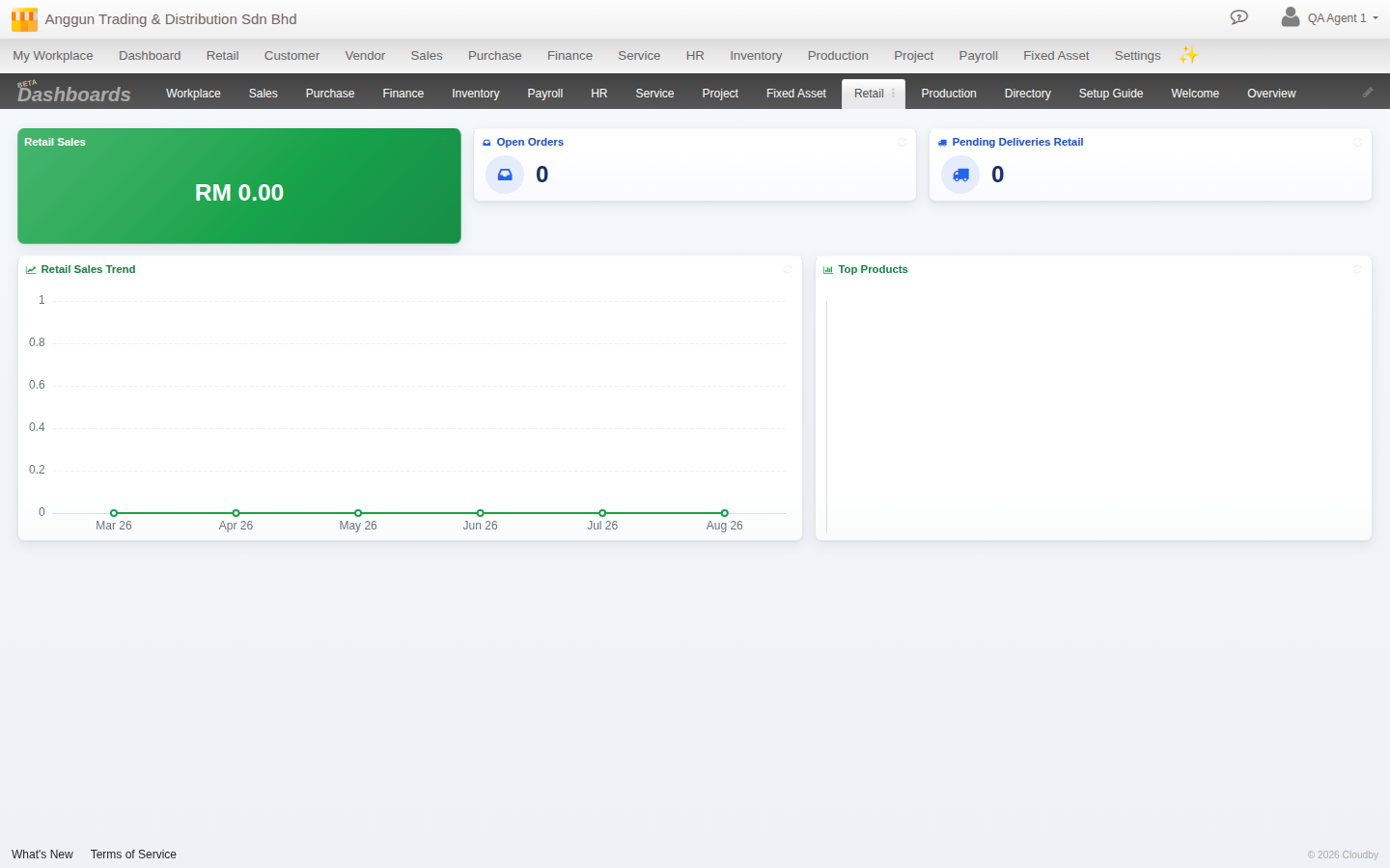
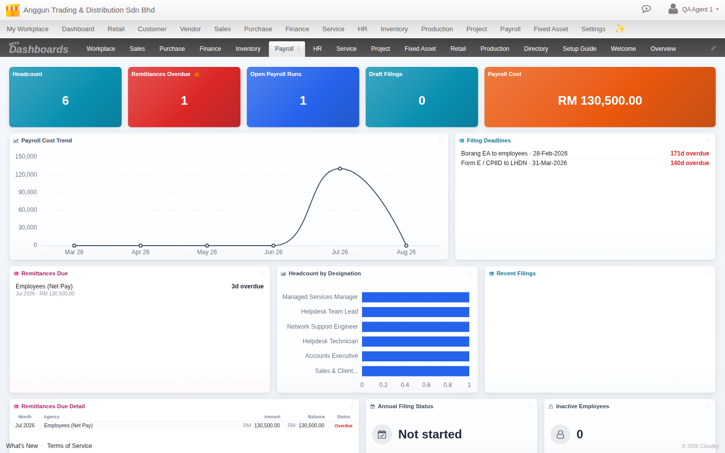
A system sheet is a shared template, not your own private copy, until you edit it. The moment you enter Edit mode on one and change anything, Cloudby forks it into your own personal version automatically. The shared template stays exactly as it was for every other colleague who has not customised it themselves.
10. Create your own custom dashboard sheet
Every module’s system sheet is a shared starting point, but you are not limited to those. Click the + at the end of the tab strip to start a sheet that is entirely your own: a blank canvas, or a copy of any sheet’s layout to tweak from there.
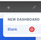
Pick Blank for a truly empty sheet, or pick a named sheet to duplicate its whole layout as your own copy, a faster starting point than building one widget at a time. Either way, you are asked to name it.
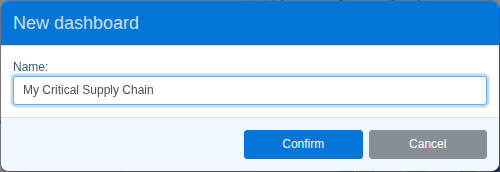
Confirm and your new sheet appears on the tab strip immediately. A blank sheet drops you straight into Edit mode, empty and ready, click Add widget (see step 5) to start filling it in.
Related
- Your dashboard: what a dashboard is, and the getting-started overview
- Navigation
- Jump Search
- Reports overview