Learn the concept
This is the step-by-step. For what it is and how it fits the bigger picture, read Top Navigation in the reference.
This is the step-by-step. For what it is and how it fits the bigger picture, read Top Navigation in the reference.
What this is
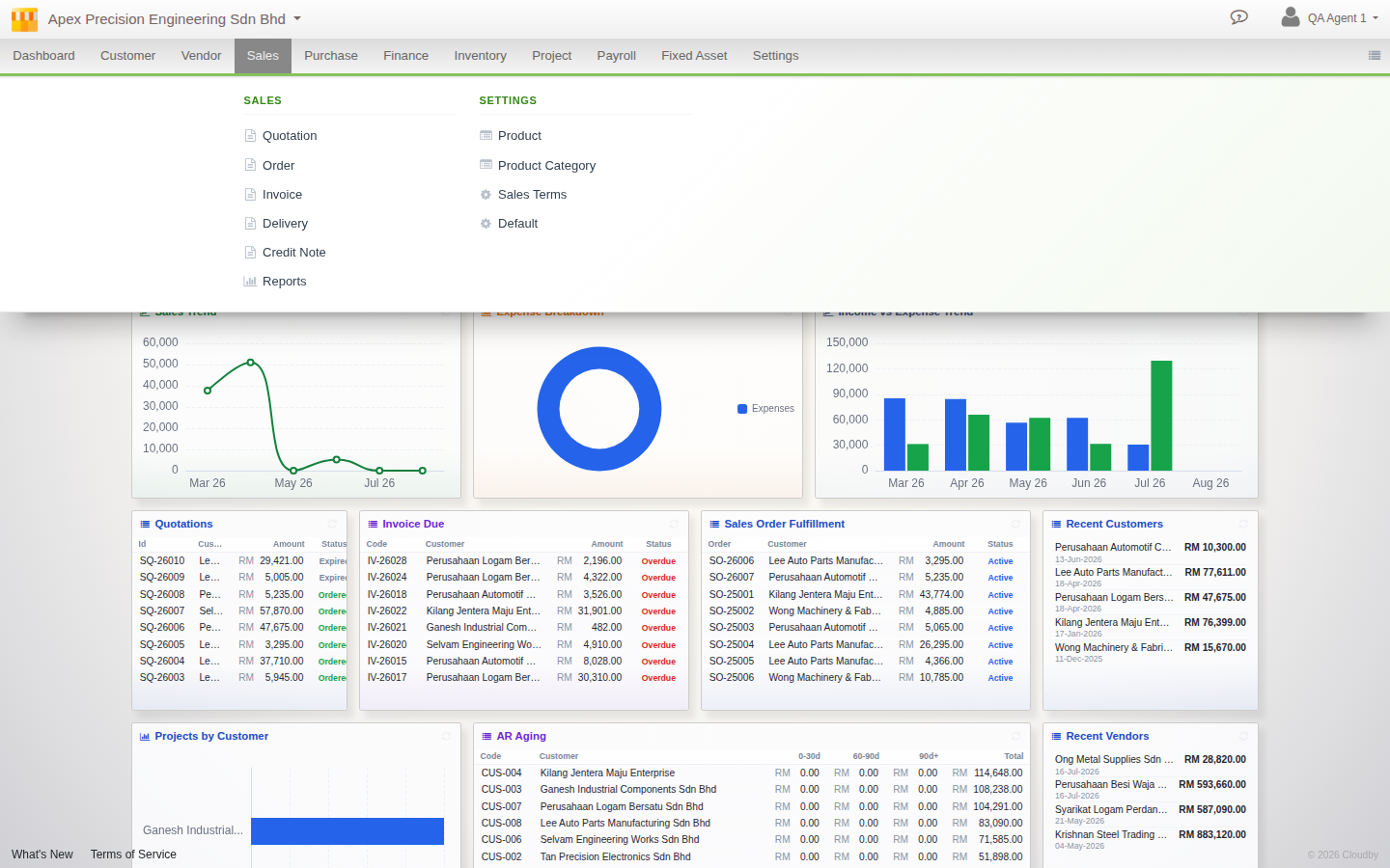
The navigation bar along the top of Cloudby opens a panel when you click a module, instead of a menu that appears on hover. It comes in three densities, so you can choose how much of the bar it takes up.
Opening a module
- Click a module name to open its panel. Items are grouped into columns, so a module with several document types and settings areas shows all of them at once.
- Only one panel is open at a time, clicking another module or clicking outside closes the current one.
- Press Esc to close a panel without navigating.
Choosing a density
A single button cycles through three densities:
- Expanded, every module with a full text label.
- Icons, the same bar compressed to icon-only buttons.
- Start, a persistent module rail down the side with a launcher, for the most screen space back.
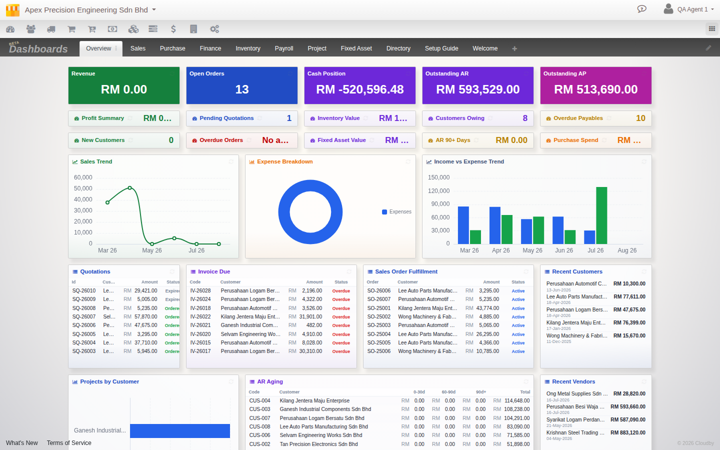
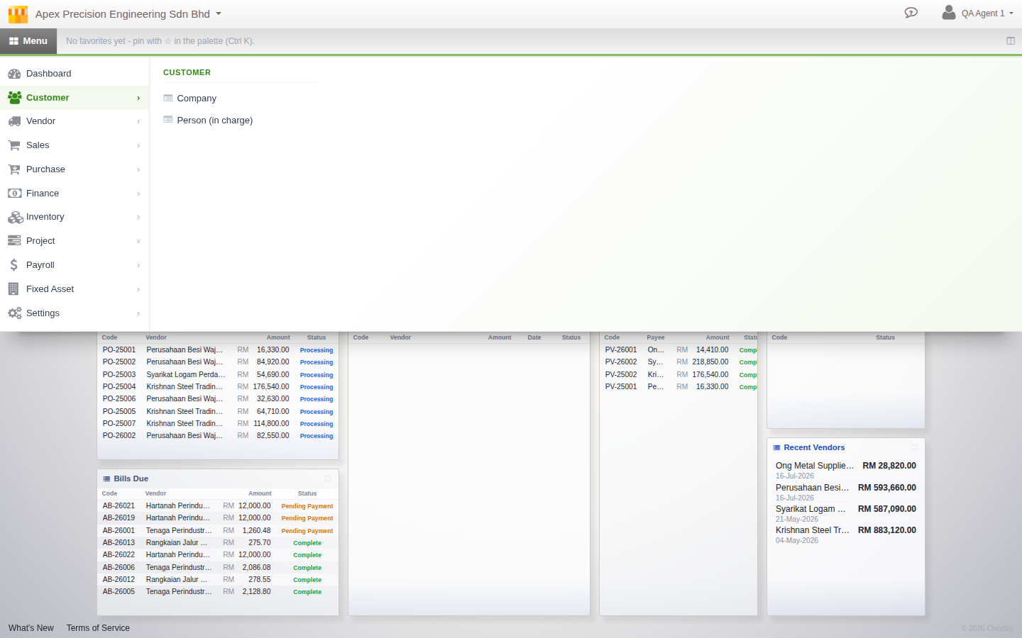
Your choice is sticky and follows you across sessions.
Favorites and recents
Star a result in Jump Search to pin it as a favorite, it then appears in your favorites strip in Start density. Recently visited pages are tracked automatically, no action needed.
Switching back to the classic bar
Open your profile menu in the top right and look for the navigation toggle to switch between the classic bar and this one, at any time.